MY ROLE
MY ROLE
MY ROLE
UX/UI Designer
TIME FRAME
Jun - Oct 2019
PLATFORM
Website
BACKGROUND
BACKGROUND
HOW THIS PROJECT CAME TO LIFE?
HOW THIS PROJECT CAME TO LIFE?
In June 2019 I have received a proposition to collaborate on an email verification project with a full-stack developer. The collaboration was born from a mutual interest in protecting user privacy in the world of cold-blooded digital services. We took off with a simple idea in mind: to create an open-source, real-time email verification service, that would not collect any users data. We called it REACHER.
SO WHAT IS AN EMAIL VERIFICATION?
You might be a freelancer looking for new clients, a PR strategist trying to reach customers in a growing startup or an email marketer doing his best to get a few hundred people on his mailing list. You start sending a bunch of emails using a popular Email Service Provider (ESP). But something's not quite right. Your emails aren’t getting through, they’re bouncing, and for every hundred people, only ten are receiving your emails. And you are certainly not alone, 48% of global mail is being marked as junk.
What is the solution?
Yes, you guessed it. It’s through the process known as email verification: It is a process of verifying if an email address is valid and improving the odds that it belongs to a real person. The whole purpose of email verification is to ensure that a real person will receive and interact with the sent email. Email Validation helps clean up your email lists or validate your single inquires to improve deliverability, helping you reach your customers. All in all, if you’re not making it to the inboxes of your subscribers/clients, it will directly translate to bad Return on Investment (ROI) and many lost opportunities.
THE PROBLEM
Knowing that no other email verification platform is open-source, creating a transparent service that doesn't rely on any existing database in its verification process (nor does it collect any of the customer's data) seemed like a truly user-centered idea. So, how could we transform our lines of code into an intuitive and easy to use, privacy-oriented tool?
PROCESS
LET'S DIG DEEPER
At the beginning, we knew one thing: REACHER will be an open-source, real-time email verification - and that was about it. I have started the process of designing our service from defining the strategy. Two questions needed to be answered: What are the user needs? What are the business needs? In other words: How can we balance business goals with user needs? In order to give an answer, I had to discover first who was our target user and get a better understanding of their behaviors, motivations and pain points. Here are some research techniques that helped me get there:
RESEARCH
QUANTITATIVE DATA : USER REVIEWS & FAQ
I sifted through hundreds of reviews, comments, and FAQ left by users on various real-time email verification platforms and review websites, and further categorized them under buckets and highlighted them in terms of importance. I learned existing user motives for using an email verification as well as collected some crucial feedback that helped me identify various pain points and areas of improvement. Some of the findings are shared below.
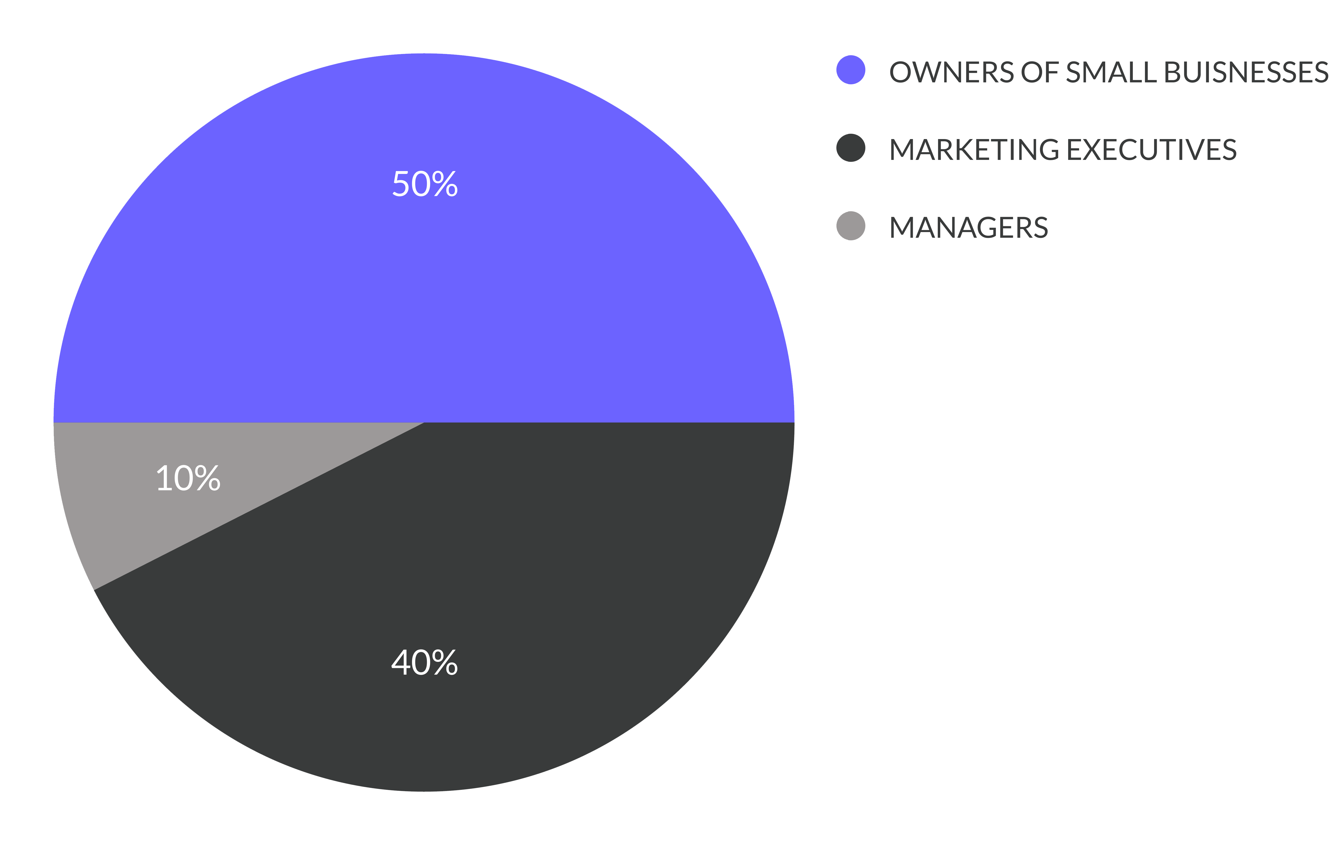
WHO IS USING EMAIL VERIFICATION?
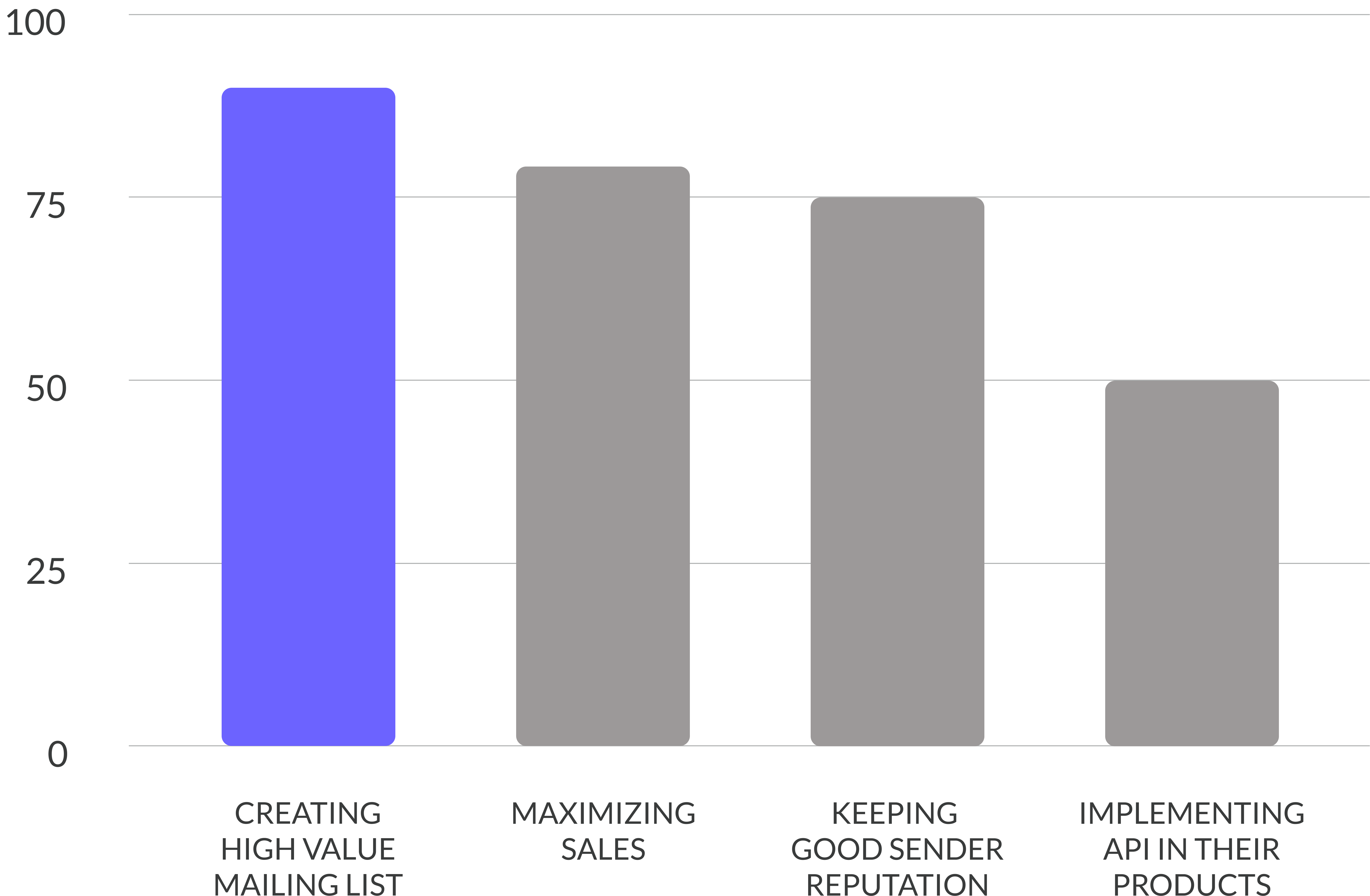
FOR WHAT PURPOSES ARE THEY USING IT?
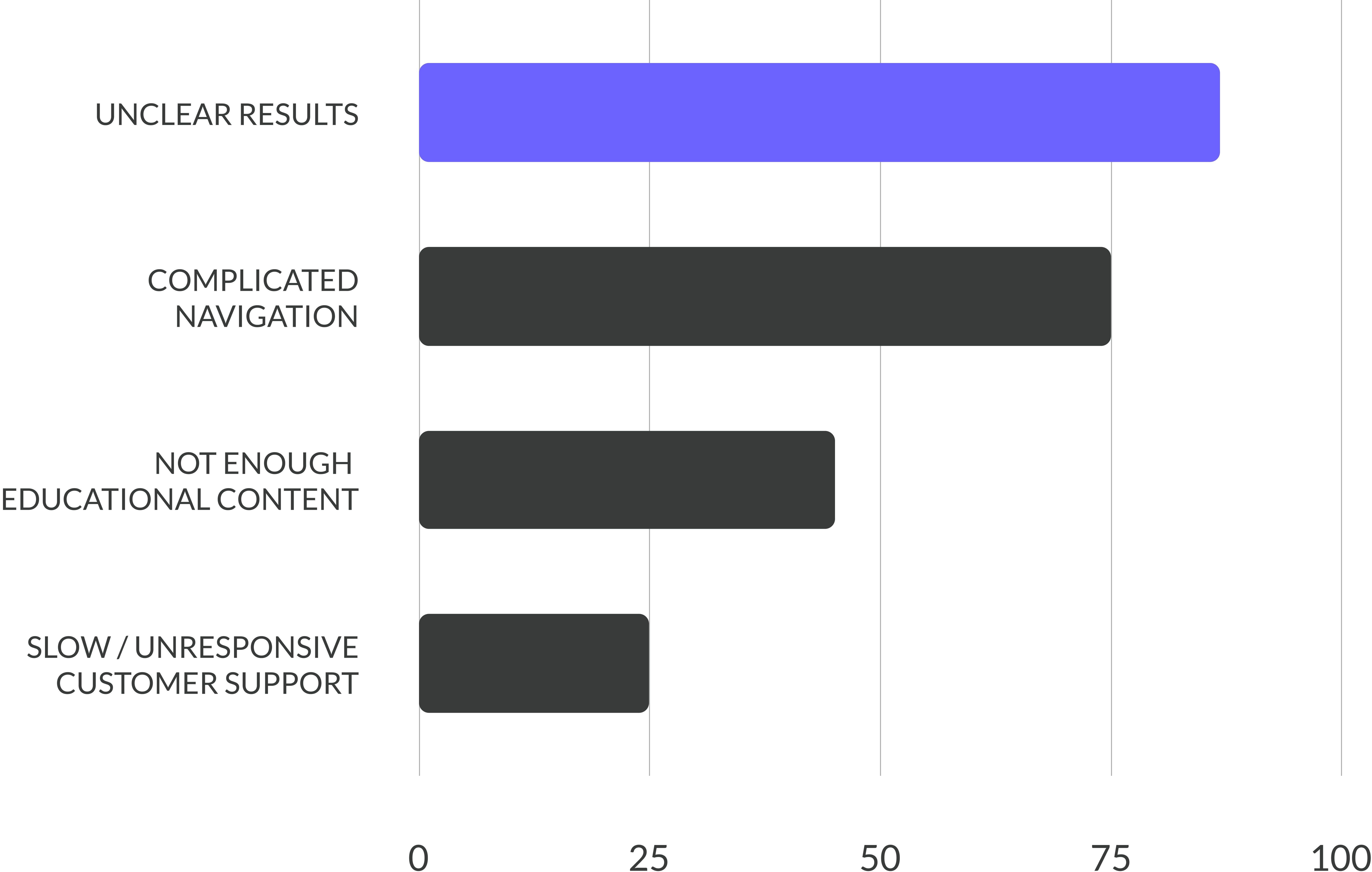
WHAT DO PEOPLE DISLIKE IN EMAIL VERIFIERS?
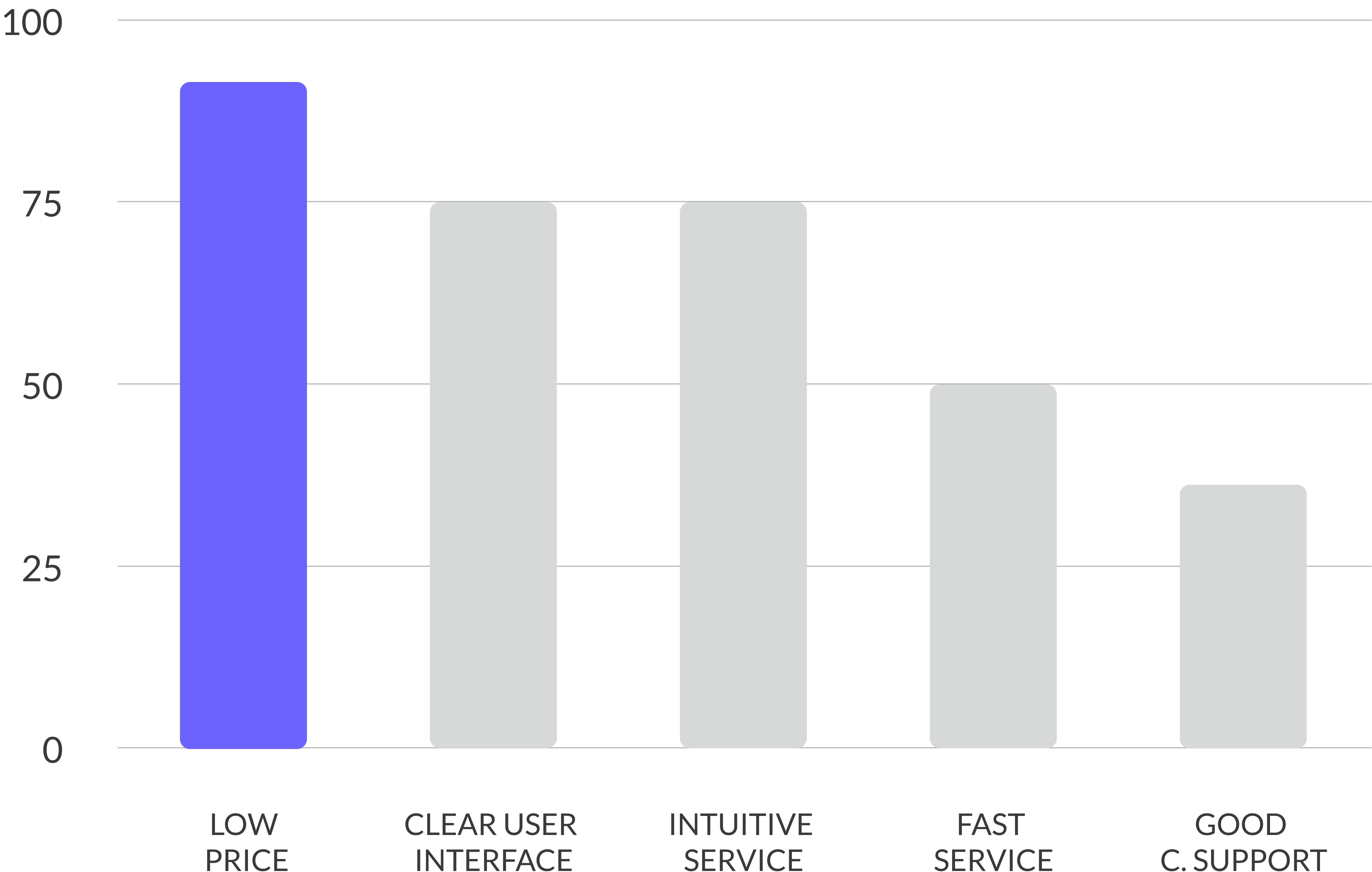
WHAT DO PEOPLE VALUE IN EMAIL VERIFIERS?
RESEARCH DISCOVERIES
RESEARCH DISCOVERIES
1 - Simplicity and Intuitiveness
Many verification services out there are overloaded with unnecessary information and complicated vocabulary, making the service less clear to a user who is unfamiliar with the topic. The service should be very simple and to the point. Any extra information should be available but only if the user is deciding to learn more.
2 - Knowledgeability
Unclear results marking and not enough information on how the service works are common user pain points when using a verification platform. Delivering exhausting results with a helpful legend should be a priority in Reacher.
3 - Low Price
Young startups want to protect their sender’s reputation and ROI but cannot spend too much money on extra services such as email verification. The service should be very affordable. (What I also discovered was that companies would usually charge big sums of money for a service that in itself didn’t generate such elevated costs. Taking advantage of us being a small team who’s well-being didn’t have to depend on this project’s income, we decided to reduce the service charges to the bare minimum, making our service the cheapest one on the market.)
4 - Quick Turn-Around
No one wants to spend any longer that’s necessary on email verification. The service should be as fast and accurate as it’s possible.
USER PERSONAS
USER PERSONAS
EVOKING EMPATHY
To make sure we are not losing the sight of our target audience, I have created 2 user personas, Julia and Thomas. They have both helped me genuinely understand our customers - define their expectations, concerns, and motivations to create a truly user-centered service.
MERGING STRATEGY WITH SCOPE
JOURNEY MAPPING
From the data collected through in-person interviews, surveys and user reviews, I have arranged my observations and classified them using a customer journey map. This helped me to show pain points and areas for improvement in the existing verification services along the entire user journey. Furthermore, it had allowed me to determine the SCOPE, where I was answering the following questions:
1 - What are the functional specifications? In other words - what is out feature set?
2 - What are the content requirements? What is required to provide value to users?
FEW REMARKS AFTER JOURNEY MAPPING
1 - Words are Important, but...
Showing (without any charges) how the verifier works is the most efficient way of making the future user understand what we check.
2 - Nothing to Hide
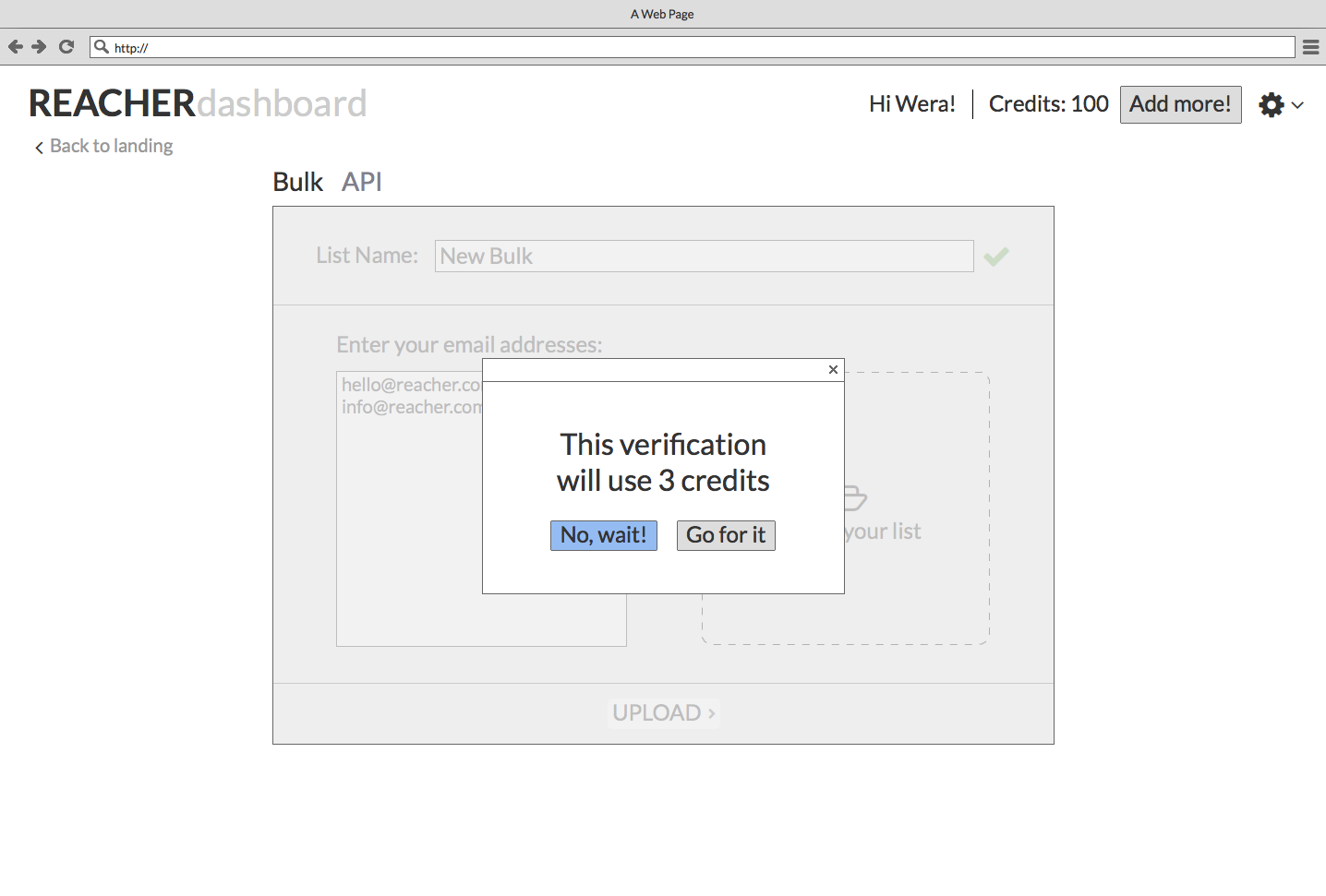
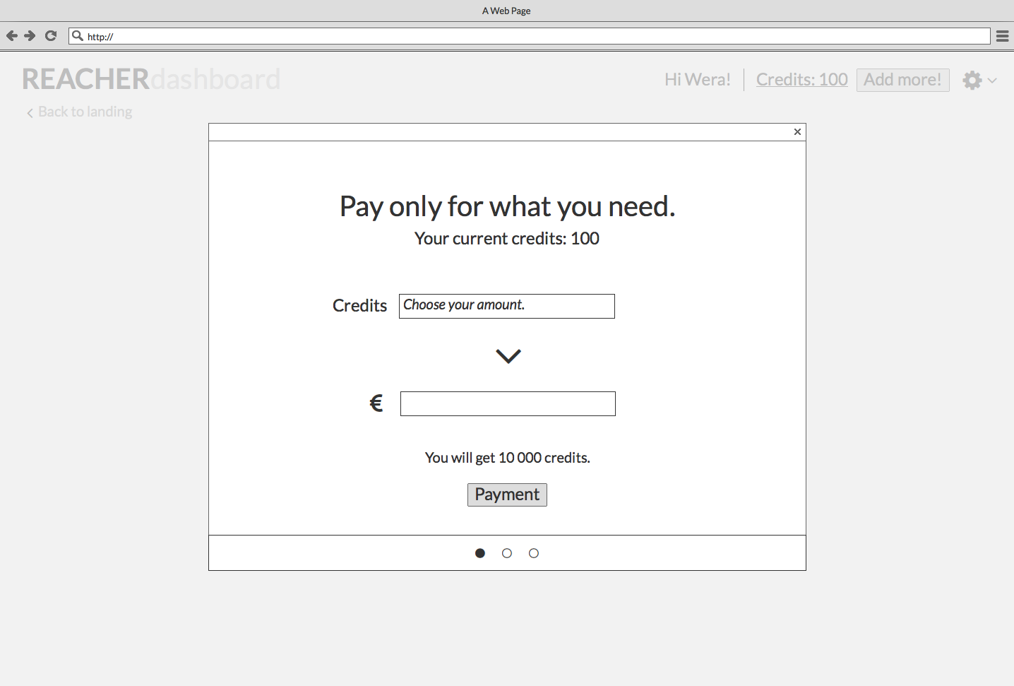
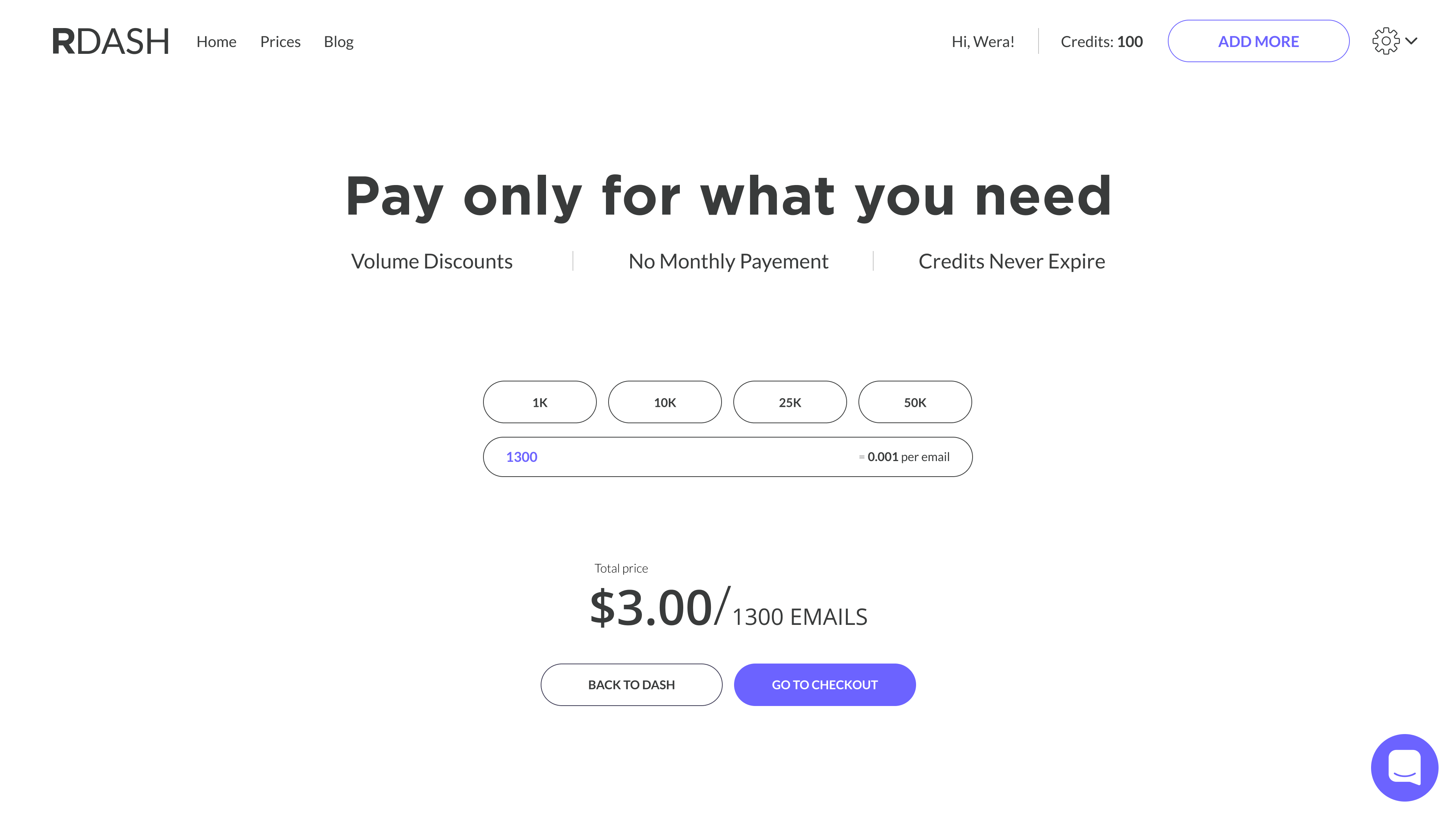
In order to be transparent, our two most important components - values and the price - should be easily available to the user. (Moreover, the price should be easily available from any place on the platform.)
3 - Quality Check
It is important to assure the user of the quality of our checks - best in comparison with our low prices.
4 - Trial Period
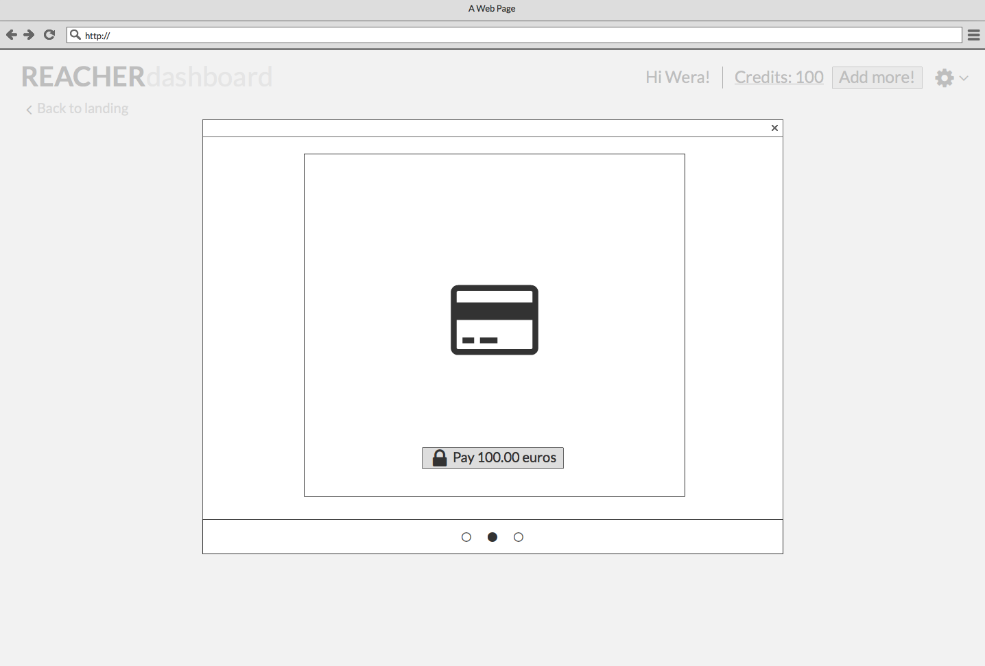
The registration shouldn’t require a credit card number. The user should be capable of trying the full service without any sign of a bigger commitment.
5 - Dashboard is where all the magic happens
The dashboard is a crucial element of the service. It is where all the verifications are taking place. Dashboard’s user experience should be very easy and intuitive - while staying informative.
6 - They are in charge
User should be capable of deleting his account at any time - without a struggle to find a right button to do so (which is the case for many verifiers out there).
TAKING A STEP FURTHER
DEFINING THE PLATFORM AND INFORMATIONAL ARCHITECTURE
DEFINING THE PLATFORM AND INFORMATIONAL ARCHITECTURE
We had decided that the deliverable best suited for our service would be a website. This way user would be capable of uploading his lists straight from the computer’s folders making the process really simple. I have clarified the concept based on my research outcomes and our business goals. Starting from rough hand sketches, followed by an information architecture mapping (that focused on a few points: visibility, content minimalism, seamless payment experience, and overall product transparency) and ending on a price flow.
We had decided that the deliverable best suited for our service would be a website. This way user would be capable of uploading his lists straight from the computer’s folders making the process really simple. I have clarified the concept based on my research outcomes and our business goals. Starting from rough hand sketches, followed by an information architecture mapping (that focused on a few points: visibility, content minimalism, seamless payment experience, and overall product transparency) and ending on a price flow.
FINAL STRUCTURE
MI-FI WIREFRAMES
After some sketching various ideas through some rough lo-fi wireframes and defining the informational architecture, I have created mi-fi wireframes that allowed me to define the content and the final structure. The outcome was three distinct views: landing page (discovery), price page (discovery) and dashboard (verification and management).
LANDING PAGE
DASHBOARD
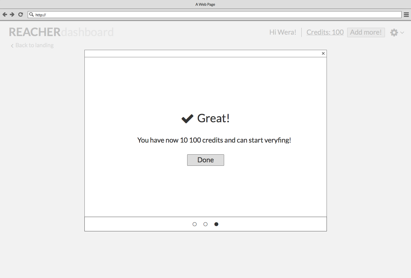
PRICE PAGE
DEFINING THE SURFACE
INTERFACE DESIGN
Reacher website Design System was built to accommodate scalability, so components can work well alongside each other, as well as render well on various device resolutions. Who said that open source means boring and unattractive? Aiming to create a pleasurable and honest service I have focused on playfulness, simplicity, total transparency and consistency throughout all the screens.
LANDING PAGE
DASHBOARD & PRICE PAGE
OUTCOME
A FEW CHARACTERISTIC OF THE INTERFACE DESIGN
1 - Non-distracting animation is guiding the user until the end of the landing page.
2 - Illustrations are making the provided services easier to understand and more joyful.
3 - Rounded shapes that are known to be more pleasant for the human eye.
4 - Pieces of the information first displayed are tailored to the primary user demands.
5 - Numerous educational information will be always available if the user wants to learn more.
WHAT'S NEXT?
WHAT I HAVE LEARNED
The process of designing REACHER was a great and rewarding challenge. It had taught me all the essential tools for conducting a thorough User Research - and how to implement it in the following design stages. It had taught me more email oriented vocabulary that I may need in the future and made me realize that keeping a business going is for many (way too many) companies more important than their users. Finding the sweet spot between our needs and our customers might seem tricky sometimes, but I believe that if we are building a product with strong values in mind, we won't go wrong.
WHERE WE'LL GO FROM NOW
WHERE WE'LL GO FROM NOW
The project is not over yet. We are testing the prototypes, making notes and continually adding little bits to our to-do list. But we don't aim for perfection. We want our service to be used and improved on its way. At this moment a fully functional API and a blog providing educational information are our priorities. Next, maybe some integrations?
We want to show the user that email verification is not a complicated service. We want to explain all the foreign vocabulary they might find someplace else, make the product even more transparent. And above all, keep it forever private and open-source, as more services should be.